In the formative years of my trading career (late ’90s), I frequently found myself scratching my head over an interesting problem.
Despite analyzing the hell out of stock chart patterns, ensuring the technicals looked quite favorable before buying, I still found my trades completely going in the wrong direction way too often.
Thanks to the help of a trusted trading mentor, I eventually discovered the problem; hyperfocusing primarily on the daily time frame.
Although the daily chart has always been pivotal for locating low-risk buy setups, my extreme focus on that single time frame was causing me to ignore the power of confirmation from longer time frames (such as weekly and monthly charts).
Put simply, I was missing the “big picture” and it was destroying my trading profits until I fixed the problem.
Are you…
Missing The Big Picture Too?
Every technical trader has his own specific approach to scanning chart patterns and locating potential buy setups.
Although I have my own, rule-based swing trading strategy, which has been thoroughly explained on this blog and nightly newsletter over the years, my trading system is just one of many types of successful trading methodologies out there.
Nevertheless, there is one trading technique you (and every trader) should always use, regardless of your individual trading style:
Multiple Time Frame Analysis
Multiple Time Frame Analysis (let’s call it “MTF” hereafter) is an extremely simple, yet incredibly powerful concept, that can be applied to analysis of stocks, ETFs, forex, futures, bitcoin, and any other financial instrument that can be charted.
If you too have been making the same mistake of hyperfocusing only on the daily charts, read on to find out why you’re missing the big picture of what’s really happening with the stocks and ETFs you trade.
Exploring For Oil On Multiple Time Frames
One of the ETFs currently on my watchlist for potential buy entry is SPDR S&P Oil & Gas Exploration ETF ($XOP). Using MTF analysis, I will show you how this ETF actually landed on my swing trading watchlist.
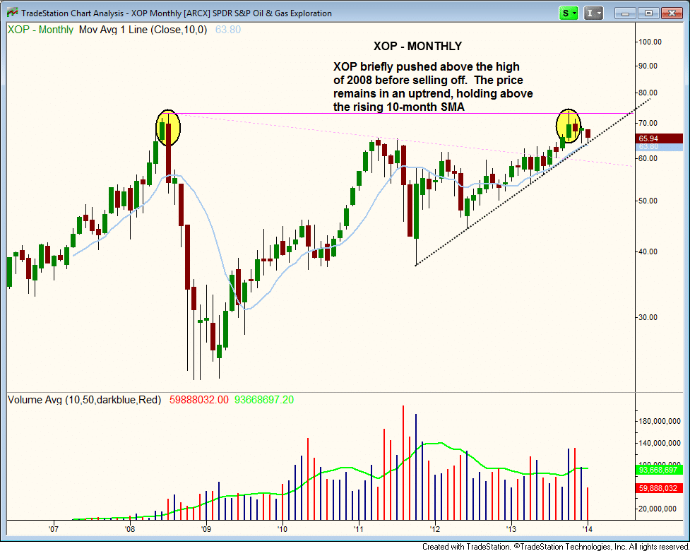
Starting with a long-term monthly chart showing at least 10 years of data or more (if possible), we see that $XOP stalled at resistance of its all-time high a few months ago.
If you were buying $XOP based strictly on a daily chart with three to five years of data at that time, you probably would not have even seen the highs from 2008:

Although $XOP pulled back after bumping into resistance of its 2008 high, the ETF firmly remains in an uptrend, above support of its rising 10-month moving average. Furthermore, the current base of consolidation is holding above the prior highs of 2011.
The next step in my MTF analysis is to zoom in to the shorter-term weekly chart interval, where each bar represents a full week of price action:

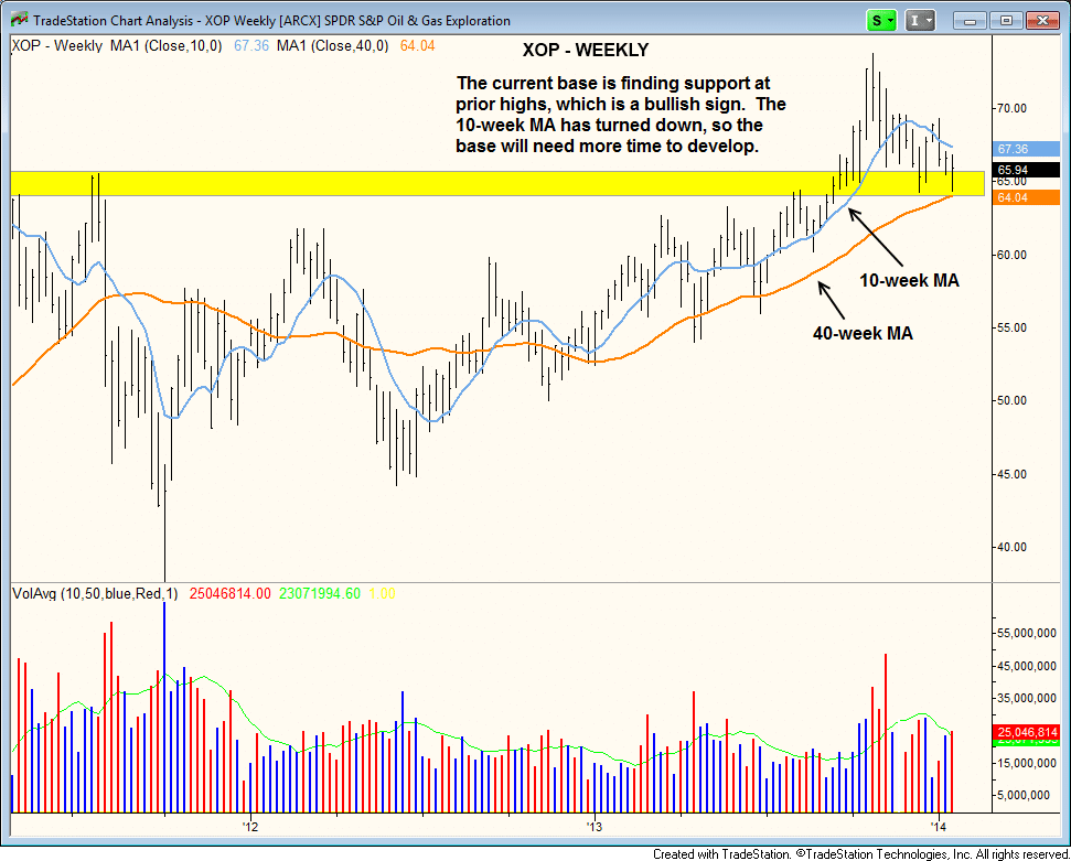
On the weekly chart, notice the 10-week moving average is trending lower, but the price is still holding above the 40-week moving average. The 10 and 40-week moving averages are similar to the popular 50 and 200-day moving averages on the daily chart.
The current base of consolidation will take some time to develop, but as it chops around the 10-week moving average, the price should eventually flatten out and begin to tick higher.
Finally, let’s use MTF analysis to drill down to the benchmark daily chart time frame:

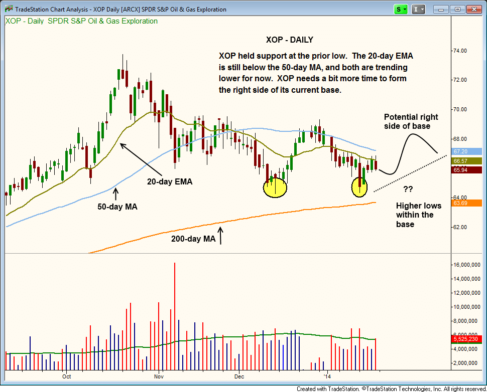
The $XOP daily chart shows last week’s price action holding above the prior swing low. If this low holds, the price action can begin to set “higher lows” with the base and form the right side of the pattern (learn more about base building patterns here).
The next breakout in $XOP will likely be the one that launches the ETF to new highs on multiple time frames, which would be a very powerful buy signal.
Still, if you were to only glance at the daily chart of $XOP, without taking into account the weekly and monthly chart patterns, you might understandably make the mistake of assuming this ETF is not in a steady uptrend.
On the contrary, the “big picture” provided to you by MTF analysis definitely shows a dominant, long-term uptrend in place. Pullbacks and consolidations along the way, such as shown on this daily time frame, are completely normal.
Why Longer Is Better
Now that you understand the easy, yet crucial concept of MTF analysis, you may be wondering which individual time frame holds the most weighting, especially in the case of conflicting chart patterns.
Remember, in the beginning of this article, when I told you about that problem I had when I first started trading?
As I found out the hard way, a longer time frame always holds more weight over a shorter time frame.
In the best, most promising stock trading setups, all three chart time frames (daily, weekly, monthly) will confirm the patterns of one another.
But if that is not the case, just remember that a weekly trend is more powerful than a daily trend, while a monthly chart holds more sway than a weekly trend.
Of course, you must also keep in mind that longer time frames also take a longer period of time to work themselves out.
For example, daytrading based on a weekly chart pattern does not work. However, that same weekly chart is of paramount importance if you are looking to buy a stock as a core/position trade.
There’s no doubt in my mind that utilization of Multiple Time Frame Analysis will substantially increase your trading profits…but only if you make the decision right now to start applying this underrated technique to all your stock chart analysis.
To profit from swing and position trading the best ETF and stock picks (using our precision MTF analysis), subscribe to The Wagner Daily now.

Thank you, my last few trades have been losers and now I now why. I was starting to fall into that hyperfocusing mode and no looking at the bigger picture. Your timely was perfect.
Hi Ian,
Thanks for your comments. Glad you enjoyed the article.
After the big sell-off of January 24 (which followed several days of higher volume selling), it may be time to lay off the gas pedal with new trade entries for a while. Nevertheless, now you can remember to look at the “big picture” when it’s time to buy stocks again.
Best of trading to you,
Deron
Thanks for the advice on the current conditions, I agree, and sorry for the typos
My pleasure.
Don’t worry about the typos (it’s not a grammar blog). Your input is welcome anytime.
Cheers,
Deron