market timing model:
Confirmed Buy – Signal generated on the close of September 4 (click here for more details)
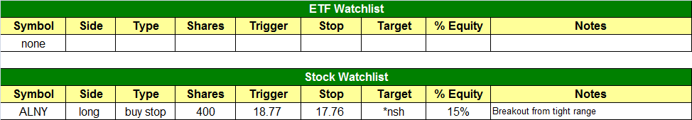
today’s watchlist (potential trade entries):
Having trouble seeing the open positions graphic above? Click here to view it directly on your web browser instead.
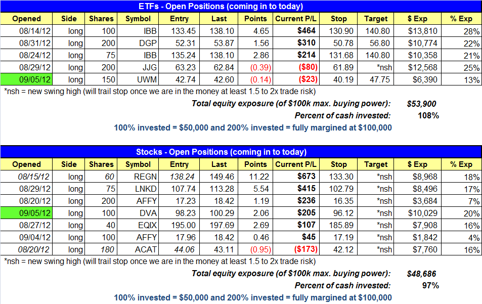
open positions:
Below is an overview of all open positions, as well as a report on all positions that were closed only since the previous day’s newsletter. Net P/L figures are based on two separate $50,000 model portfolios (one for ETFs and one for stocks). Changes to open positions since the previous report are listed in pink shaded cells below. Be sure to read the Wagner Daily subscriber guide for important, automatic rules on trade entries and exits.
Having trouble seeing the open positions graphic above? Click here to view it directly on your web browser instead.
closed positions:
Having trouble seeing the closed positions graphic above? Click here to view it directly on your web browser instead.
ETF position notes:
- UWM buy limit entry triggered on the open.
stock position notes:
- DVA buy entry triggered.
ETF and broad market commentary:
Another choppy, erratic day of trading was the dominant theme on Wall Street yesterday, as the bulls and bears apparently engaged in a game of tug-of-war. In the end, it was basically a draw, as all the main stock market indexes closed near the flatline. The Dow Jones Industrial Average ($DJIA) eked out a gain of 0.1%, the S&P 500 Index edged 0.1% lower, and the Nasdaq Composite ($COMPQ) slipped 0.2%. The small-cap Russell 2000 and S&P MidCap 400 indices eased by 0.1% and 0.2% respectively. As has been the case for the majority of the trading sessions over the past week, the major indices closed just below the middle of their intraday trading ranges, showing apathy and a lack of commitment into the close.
In the NYSE total volume ticked 4% higher. Turnover in the Nasdaq was 2% lighter than the previous day’s level. Although the S&P 500 technically posted a higher volume loss, it would be inaccurate to label yesterday as a definitive “distribution day” because both the percentage loss of the S&P 500 and the percentage increase in volume was insignificant. Overall, it seems we continue to deal with a broad market that refuses to follow-through in one direction or the other for more than a day or two. However, unless we have a confirmed “sell” signal, the direction of the main stock market indexes typically does not heavily determine the outcome of our individual positions anyway, as we focus on trading ETFs and stocks with relative strength to the broad market.
When gold ETFs broke out on August 31, we bought DB Gold Double Long ($DGP), a leveraged version of the popular SPDR Gold Trust ($GLD). In the following day’s commentary, we briefly pointed out that silver ETFs (such as $SLV) had broken out as well. In fact, the spot silver commodity has actually been outperforming spot gold (and the corresponding precious metals ETFs) in recent weeks. So, if silver ETFs have been showing more near-term strength than gold ETFs, why did we buy a gold ETF instead? Read on to see…
Below is a “percentage change chart” that compares the price of the main silver ETF ($SLV) versus the popular gold ETF ($GLD). Rather than showing actual prices of each ETF, this type of chart merely compares the performance of one instrument to another, and reports the percentage price differences between the two. The chart shows the relative price action between SLV versus GLD over the past 30 days. Take a look:

As you can see, SLV has clearly been showing relative strength to GLD over the past several weeks. Notice that GLD (the blue line) was tracking relatively in sync with SLV (the red line) until around 17 August. Then, SLV suddenly began to show relative strength by outperforming GLD. Over the past 30 days, the chart also indicates that SLV has gained 15%, while GLD has only rallied 5%. However, one mistake swing traders frequently make is limiting their technical analysis to analyzing only one particular timeframe, such as the daily chart, without comparing the patterns of longer-term chart intervals.
It is important to use multiple time frames when doing your daily research and analysis of potential stock and ETF trades because there are times when one chart timeframe indicates a completely different technical situation than another timeframe. As swing traders, we base most of our detailed entry and exit points on the daily chart patterns, but we always assess the longer-term weekly chart patterns to look for confirmation of trend. Ideally, we want both the daily and weekly charts to be aligned with one another. When they are not, the odds of a successful trade are reduced.
If comparing the longer-term weekly charts of SLV and GLD, it quickly becomes apparent that SLV has a lot more technical price resistance and overhead supply to work through before recovering back to its year 2011 highs. To illustrate this, we use a technical indicator known as Fibonacci retracement lines, which seeks to predict significant price levels where a stock or ETF may reverse, or at least take a significant pause. The first chart below is a weekly chart of $SLV:

As shown on the chart above, SLV has only retraced about 25% of its decline from the April 2011 high to June 2012 low. It has not even recovered to the first major Fibonacci resistance level of 38.2%, despite its relative strength over the past few weeks. By comparison, take a look at the weekly chart of GLD with Fibonacci retracement lines:

Unlike SLV, GLD has already moved above its 38.2% Fibonacci retracement level, which means it has already reclaimed more of the loss from its year-long correction than SLV. As such, there is proportionately less overhead supply with GLD compared to SLV, which should make it easier for GLD to attempt to rally back to its 2011 highs over the longer-term.
In this situation, where the shorter-term chart of SLV is showing more strength than GLD, but the longer-term chart is showing the opposite, it’s important to realize that the longer-term chart interval bears the most weight, and therefore holds the most significance in ultimately determining the direction of the trend. If, for example, the daily chart of a stock or ETF shows a bullish breakout above resistance, but the weekly chart shows the breakout to merely be running into a one-year downtrend line, resistance of the downtrend line on the weekly chart should be viewed as more important than the breakout on the daily chart (except perhaps only for intraday traders).
Overall, SLV has indeed been showing relative strength to GLD over the past several weeks, but the question is how long will it be able to retain that relative strength, given that SLV has substantially more technical resistance and overhead supply to contend with than GLD. This is the reason we decided to buy a gold ETF, rather than a silver ETF, when both precious metals broke out above resistance of their 200-day moving averages on August 31. Even though we are primarily short-term swing traders, we still prefer to have intermediate and long-term price momentum in our favor, rather than fighting against it. Water running down a hill will always flow in the path of least resistance. The same is true of technical analysis in the stock market, which is why multiple timeframe analysis is so important.
stock commentary:
ALNY remains on the watchlist as it continues to trade in a tight range below our entry point. DVA triggered our buy entry on monster price and volume action yesterday but gave back about half of the day’s gains by the close. The intraday gain was extremely overdone by 12pm. To put the morning move in perspective, most of the stocks we trade run about 4 to 8 ATRs from our entry point in 2-4 weeks. DVA traveled nearly 4 ATRs by 12! The good news is that DVA finished with a new 52-Week High closing price on big volume. We will have to be patient as the stock digests yesterday’s advance over the next few days.

LNKD also exploded higher yesterday, gaining almost 6% on big volume. We continue to see small and mid-cap stocks rip higher while the major averages chop around.
If you are a new subscriber, please e-mail [email protected] with any questions regarding our trading strategy, money management, or how to make the most out of this report.
relative strength combo watchlist:
Our Relative Strength Combo Watchlist makes it easy for subscribers to import data into their own scanning software, such as Tradestation, Interactive Brokers, and TC2000. This list is comprised of the strongest stocks (technically and fundamentally) in the market over the past six to 12 months. The scan is updated every Sunday, and this week’s RS Combo Watchlist can be downloaded by logging in to the Members Area of our web site.