 One of the first things you probably learned while studying technical analysis is how to draw a simple trendline.
Most books focus on drawing trendlines by connecting a series of “higher lows” to show support (in an uptrend), or connecting a series of “lower highs” to show resistance (in a downtrend).
This is basic technical analysis 101.
But what’s lesser known is that you can also draw trendlines on the weekly and monthly charts in a way that forecasts resistance in uptrending stocks or indexes.
Even in steadily uptrending stocks trading at fresh all-time highs, “limiting trendlines” can accurately predict when rallies are likely to stop — or at least lose their momentum.
Continue reading to discover how limiting trendlines can improve your trading efficiency by maximizing your profits in uptrending stocks and ETFs.
What’s So Limiting About Limiting Trendlines?
A limiting trendline can be drawn by connecting the major “swing highs” (peaks) that appear on the chart of a stock’s long-term uptrend.
We refer to these lines as “limiting trendlines” because their presence can swiftly put the brakes on a rally — even with stocks at all-time highs that are otherwise lacking resistance.
This simple concept works best on weekly and monthly chart time frames, preferably using a linear (non-logarithmic) chart.
Determining how to precisely draw these trendlines is not cut and dry; rather, it’s a bit of an art form.
So, we try to keep it honest and filter out the “noise” by simply using logical swing highs as the connecting points on a chart.
Got it? If not, don’t worry!
Just check out the four annotated charts below and it will make perfect sense!
Limiting Trendlines: Nailing Resistance Levels In 4 Hot Stocks
Facebook ($FB)
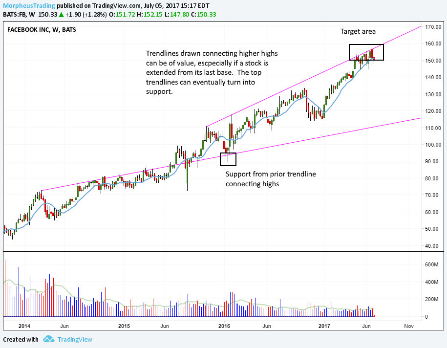
Facebook is a pretty good example of a stock that had a limiting trendline that connected the highs during the summer of 2014.
It wasn’t until late 2015 that $FB cleared the top trend line and was able to improve the angle of its attack in 2016 and 2017.
Ollie’s Bargain Outlet ($OLLI)
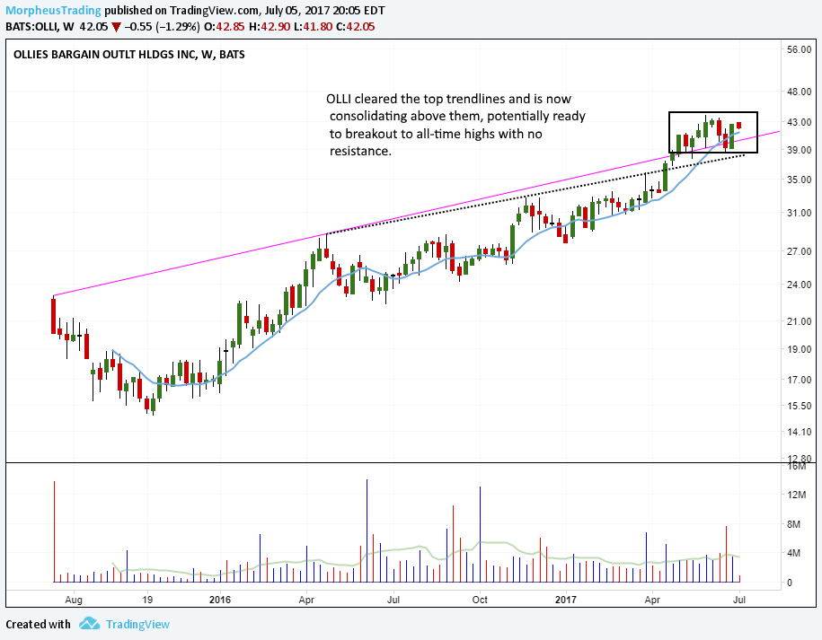
Looking at the weekly chart of $OLLI below, notice the stock recently cleared two limiting trendlines, which are now acting as support.
A move through the highs of the current range and $OLLI is free of all price and trendline resistance, which means it has the potential to increase its angle of attack:
Alarm.com ($ALRM)
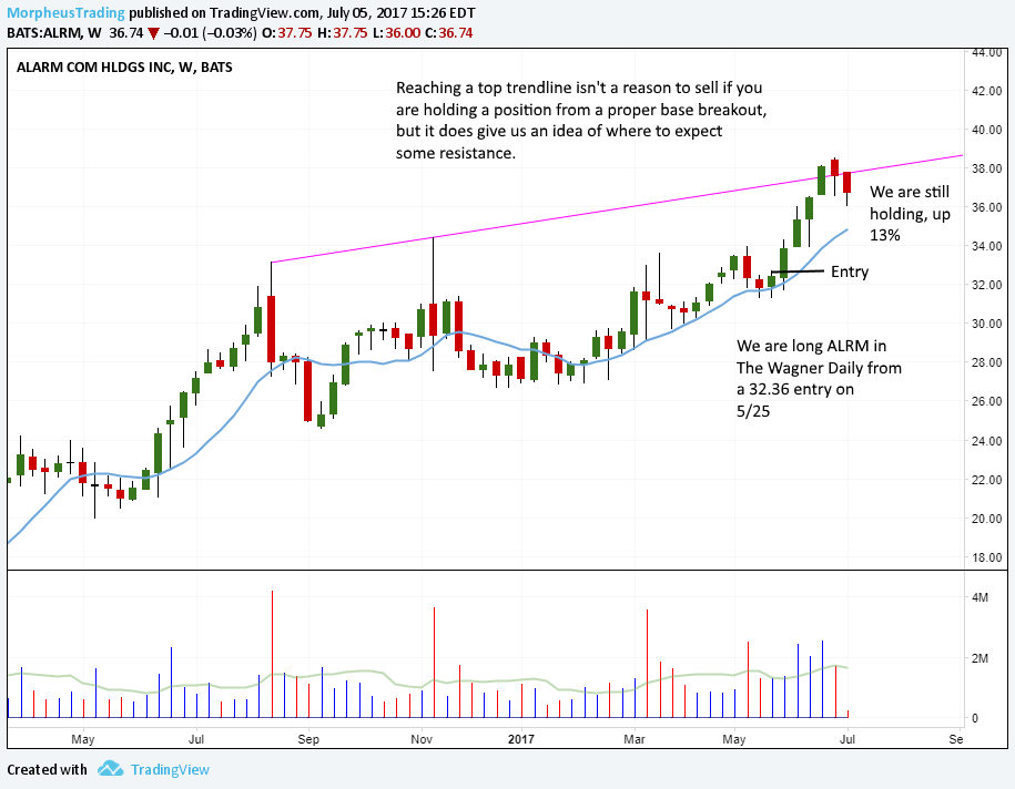
$ALRM is a current long position in The Wagner Daily that recently stalled near the upper channel of its limiting trendline.
Since the touch of the trendline arrived only four weeks after a fresh breakout to new highs, we initially did not sell any of our position.
However, the trendline gave us a heads-up and we sold $ALRM for a 12.8% gain on July 28:
iShares Russell 2000 ETF ($IWM)
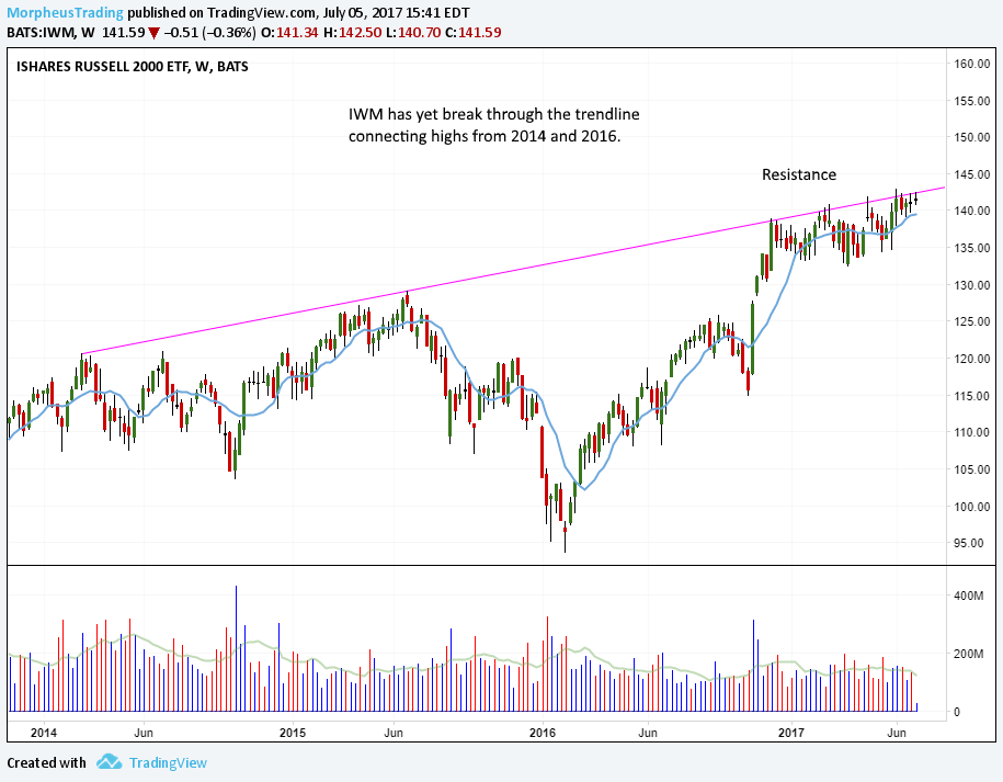
The last chart is the weekly of Russell 2000 ETF ($IWM), which has stalled at the limiting trendline on every rally attempt so far in 2017.
A move through the highs of the current range would put the Russell above the trendline and potentially into strong rally mode.
The charts above are a few well-groomed examples, but these trendlines do work and have considerable value.
The next time you are examining a chart that is breaking out to new 52-week highs, take a look at the weekly or monthly time frames to locate potential limiting trendlines.
It may just prevent you from entering a trade that has limited upside and allow money to be put to work elsewhere while waiting for the stock to clear the top trend line.
By the way, it’s fine if you do not exactly agree with the way these trendlines at the highs are drawn — just figure out a method that works for you and stick with it.
If you enjoyed this mini trading lesson, sign up now to receive our nightly stock picking newsletter and learn a “no nonsense” trading strategy that simply works.
By the way, your Wagner Daily subscription now includes simple Option picks too — all for just $49 per month or $299 per year (save 50%).
What do you think about “limiting trendlines?” Drop us a comment below with your feedback or questions.

Hi,
I guess the same logic applies to weekly/monthly support/resistance lines right?
By the way, what does the $ sign mean before tickers (e.g. $FB)?
Thanks for you interesting articles, please keep it up 🙂
Tonio.
@Tonio –
Yes, the same logic applies to trendlines of any timeframe. In fact, longer-term trendlines like weekly/monthly tend to more accurately show resistance limits than shorter timeframes.
The $ sign is the standard format used by Twitter, StockTwits, and other social media to tag a stock ticker symbol.
We appreciate your kind words and are glad you enjoy the articles.
Great Knowledge acquired. Thanks
@Mohan – Glad you enjoyed the article. We appreciate your feedback.