 2017 was a stellar year for the stock market, but an inevitable correction started to hit the market at the end of January. Here is our “no nonsense” technical analysis for what may be coming next.
With its best year since 2013, the benchmark S&P 500 Index jumped 19% in 2017.
The S&P 500 then kicked off 2018 with an impressive 7.4% gain through January 26.
But even the healthiest of bull markets do not go straight up without significant corrections along the way.
The start of February was the reckoning, as the S&P plunged 10.1% (from Jan. 26 peak to Feb. 8 closing low).
Stocks have bounced off their lows since then, but now must contend with massive overhead supply (resistance) from the sell-0ff.
Continue reading to discover what the charts are indicating for the market’s next move in the near to intermediate-term.
The Big Picture — S&P 500 Weekly Chart
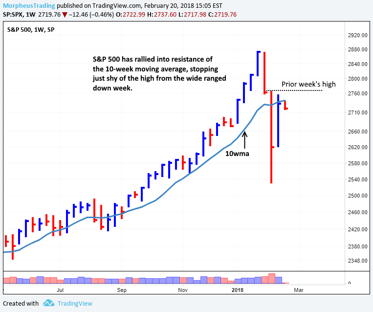
Stocks staged a substantial comeback last week, following a nasty two-week decline off the highs.
The sell-off caused the S&P 500 Index ($SPX) to slice through major support of its 10-week and 40-week moving averages (similar to 50-day and 200-day MAs on daily chart).
The decline also caused an ugly, wide-ranged bar to form on the weekly chart, which should now act as overhead resistance (see horizontal line on the chart below).
In addition to the prior high, the 10-week moving average is also acting as resistance — remember that former support levels become new resistance after the support is broken.
On the weekly chart of $SPX below, note that major resistance is in the 2,735 to 2,765 area:

When recovering from a sell-off, stocks often fail to push through the highs of a wide-ranged selling bar on the first test of resistance.
Two Possible Scenarios
1. Shallow Correction — The Worst Is Behind Us
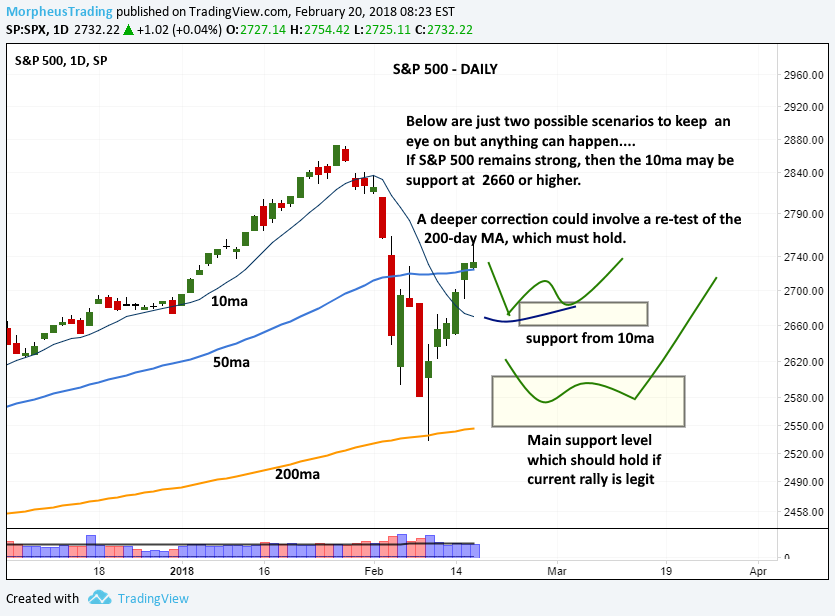
Of course, anything can happen in the stock market, but we have laid out two possible scenarios that could happen from here.
The first scenario is in play IF the S&P 500 remains strong and finds support at its first pullback to the 10-day moving average (currently around 2,680).
For this to be valid, such a pullback must not show any signs of institutional distribution (high volume selling).
Ideally, a pullback from current prices should be on lighter volume than the preceding rally off the lows.
Such a move would be quite bullish and potentially lead to the S&P 500 reclaiming support of its 50-day moving average after a short rest.
2. Deeper Correction — 2018 Could Be Challenging
On the other hand, just about anything is possible IF the 10-day moving average fails to hold on a pullback.
However, we would view any consolidation that develops while holding the 200-day moving average as constructive (in the 2,550 to 2,580 area).
A re-test all the way back down to the 200-day moving average (which the index tested intraday on February 9) would suggest more time is needed to repair the technical damage from the sell-off.
Both scenarios are annotated on the daily chart of $SPX below:

The Even Bigger Picture — S&P 500 Monthly Chart
When markets are in correction mode, it is helpful to zoom out and look at the really long-term charts to see the real “big picture” of the trend.
The longer a trend has been in place, the more powerful the trend will be.
As such, an uptrend on a monthly chart yields more power than a downtrend on a daily chart.
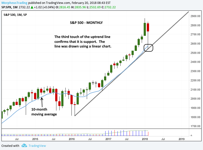
On the monthly chart of the S&P 500, a steady uptrend remains in place.
The uptrend line that began with the 2016 lows was validated by the third touch of the trendline (the first two are just anchor points).
If the S&P continues to chop around for some time, then monthly trendline support should help create higher lows due to the higher support level in March.
Check it out:

Individual Stock Performance Matters More
While it is important to follow the price and volume action of broad market averages like the S&P 500 or Nasdaq Composite, you should not focus only on these charts to determine the health of the market.
The weekly charts of individual stocks, especially market leadership stocks, should always play a significant role in your analysis.
If you would like to learn how to identify leadership stocks and when to buy them, sign up now for your subscription to our nightly stock pick newsletter ($49/month or $299/year).
Which scenario above do you think is more likely? Drop us a comment below with your thoughts.
