After last Wednesday’s (September 18) surprise Fed announcement on economic policy (no tapering), all the main stock market immediately indexes sprinted to fresh multi-year or all-time highs.
However, that afternoon’s bullish knee-jerk reaction faded quickly, causing both the S&P 500 and Dow Jones Industrial Average to wipe out all their Fed-day gains (and then some) just two days later.
Nevertheless, although last Friday’s bearish reversal created false breakout patterns in the S&P and Dow, both the small-cap Russell 2000 and NASDAQ Composite showed substantial relative strength to the broad market that day (both indices only surrendered a fraction of their Fed-day gains).
Furthermore, since last Friday was a quadruple witching day, we are suspicious of the validity of last Friday’s market weakness (we are always suspicious of all price action on quadruple witching days).
All Mixed Up
Given the mixed signals generated by the whipsaw price action of September 18 and 20, combined with the price divergence among the major indices, investors and traders understandably may be scratching their heads right now.
As such, let’s bring some clarity into the situation by simply looking at the basic technical chart patterns of the Dow Jones Industrial Average, S&P 500 Index, small-cap Russell 2000 Index, and NASDAQ Composite Index.
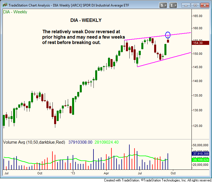
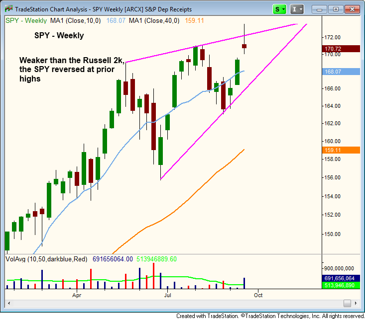
Last Friday’s bearish reversal completely wiped out Wednesday’s (Fed day) strong advance, thereby creating false breakouts to new highs in both the S&P 500 and Dow Jones.
Below, this is shown on the weekly charts of Dow Jones Industrial Average SPDR ($DIA) and S&P 500 SPDR ($SPY), two popular ETF proxies for the Dow and S&P:

On the chart of $DIA above, notice that the Dow has yet to produce a convincing “higher high” over the past few months and has basically been range-bound. Next, take a look at $SPY:

The weekly chart of $SPY is more bullish, as a clear “higher low” is in place (which forms the lower channel trendline). However, the angle of its upper channel resistance is still pretty flat (just like $DIA).
More Room To Run
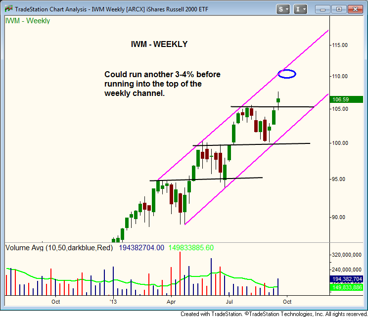
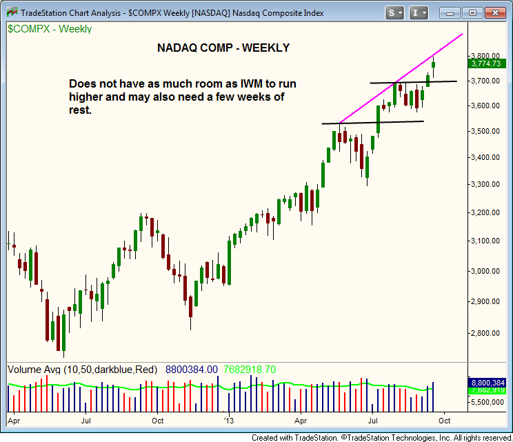
Just as last Friday’s losses in the Dow and S&P were greater than the declines in the NASDAQ and Russell 2000, there is quite a bit of price divergence on the weekly charts of iShares Russell 2000 ($IWM) and the NASDAQ Composite Index ($COMPX) when compared to $SPY and $DIA.
On the weekly charts of $IWM and $COMPX below, notice the upper channel trendlines are at a much steeper angle:


The relative strength on the weekly charts of the Russell 2000 and NASDAQ Composite is easy to see because there has been a clear sequence of “higher highs” and “higher lows” in place since April.
While the Dow still must overcome its prior highs to break out, the only resistance for the Russell 2000 is its upper channel trendline (which is still 3-4% away).
It’s pretty much the same technical picture on the NASDAQ weekly chart, although the tech-heavy index may need to rest after bumping into resistance of its upper channel trendline.
Still, any pullback in the NASDAQ should be short-lived, as there isn’t much overhead supply or resistance to contend with until the 4,000 level.
As always, remember to trade what you see, not what you think!
Profit from swing trading the best small to mid-cap cap stocks. Start your risk-free Wagner Daily subscription now!
